Branding for Malachi’s Storehouse, an emergency food ministry, began with the logo. The principal element of the logo are loaves of bread. Bread is one of the staples distributed to clients every week. It is also an important symbol of communion. In the logo, the loaves of bread fan out to resemble the lotus flower. The lotus flower has many spiritual meanings including “rising out of suffering”.
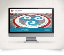
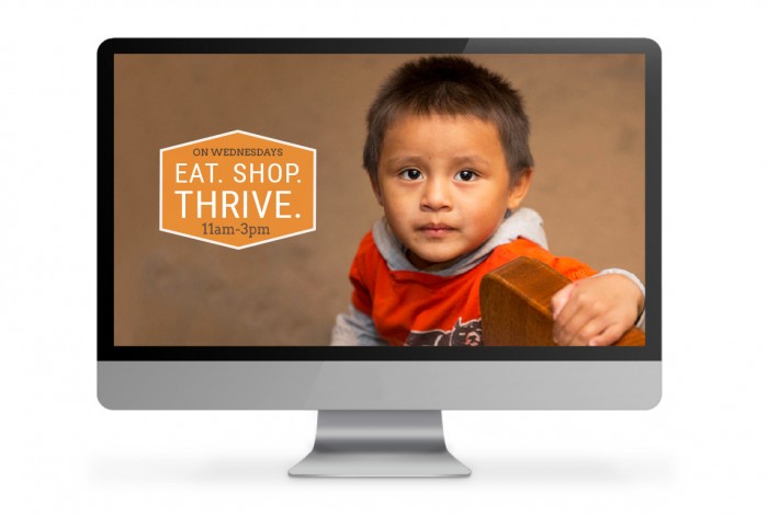
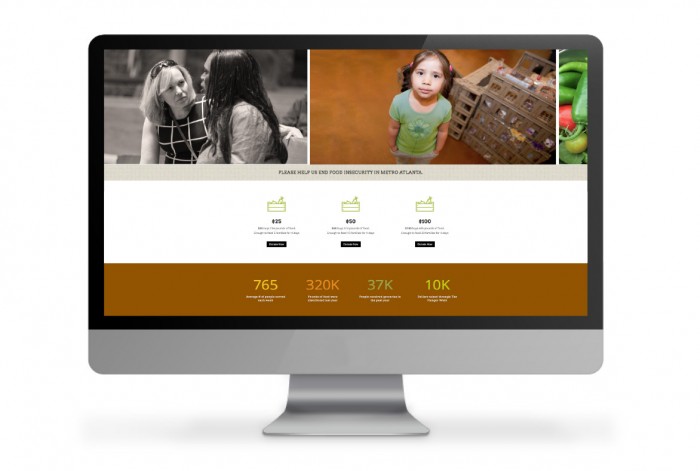
Malachi’s Storehouse is so much more than a food pantry but you would not have known it from their prior website. We knew there was a better way to tell their story so we came up with the “EAT. SHOP. THRIVE.” concept. This concept allows a visitor to the site to quickly understand how the Storehouse is organized and operated. Use of animated numbers and graphs visually shows how many people Malachi’s serves. Board members agree that this new site is compelling, easily navigated and captures their spirit and mission.
Malachi’s Storehouse
- Categories →
- Logos (1-10)
- Web Design