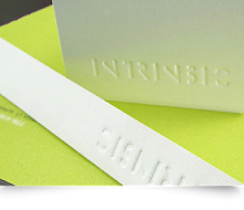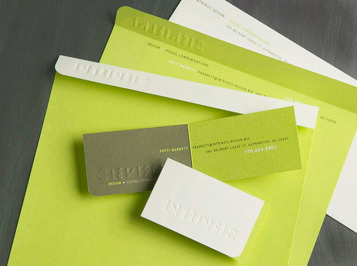
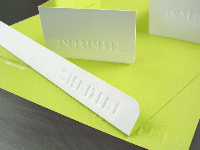
We wanted an identity package that would be sophisticated and stand out in this current marketplace. Most of all, we wanted it to reflect who we are and what we do. The blind-debossed Intrinsic logo gives the subtle impression of going within to discover what is “intrinsic” or natural to our clients’ companies. The vibrant green of the letterhead represents the uniqueness interpreted and our logo revealed upside-down or backwards by lifting the flap is a reminder that Intrinsic Design works on each client’s problem with an inside-out approach.
We were thrilled when our package was chosen by Mohawk to be used as a field sample.
Intrinsic Identity
- Categories →
- Print Design